IV. ANALYSES
In order to analyze the data, I ran a series of 10 regressions, attempting to find the one that best predicted the 2008 nationals results from the 2008 state and regional scores. To make the model marginally more robust, I ended up adding a “tier” variable to help the models differentiate between top programs, mid-range programs, and lesser programs (all of which demonstrate different trends in competition evolution). The following table provides a list of the successful regressions I ran (that is, regressions where the residual plots did not violate linear regression assumptions), in R code, along with their respective R2 values.
- fit1=lm(NAT~STA,acadata3) R2 - .8872
- fit2=lm(NAT~STA+REG,acadata3) R2 - .8822
- fit3=lm(NAT~STA,acadata3[acadata3$REG!="",]) R2 - .8821
- fit4=lm(NAT~STA+WIS+CALI+ARI,acadata3) R2 - .8944
- fit5=lm(NAT~STA*TIER+WIS+CALI+ARI,acadata3) R2 - .9116
- fit6=lm(NAT~STA+WIS+ILL,acadata3) R2 - .8956
- fit7=lm(NAT~STA*TIER+REG,acadata3) R2 - .8892
- fit8=lm(NAT~STA*TIER,acadata3) R2 - .9086
- fit9=lm(NAT~STA*TIER+WIS+ILL,acadata3) R2 - .9143
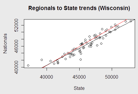
By this metric, fit 9 was the best. This did not surprise me. Wisconsin and Illinois are different from the other top tier schools in one rather important aspect: they are states with one school that always wins state and goes to nationals. Due to this, virtually every year they have a significant number of returning students. This leads to an interesting (though slight) phenomenon, as expressed in the following graph. The lines represent trendlines, with the black line being all non-Wisconsin schools and the red line being Wisconsin.

I would argue that this graph indicates a subtle but distinct “clutch” performance metric; if their state score is higher, Wisconsin tends to step up their performance and perform better than comparable schools do in such situations. The same holds true for Illinois.
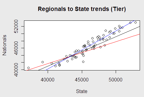
This trend analysis holds for the “Tier” variable, as well, composed of a numerical indicator of the general quality of the school’s Decathlon program over the past decade. The blue line indicates top tier schools, the black line normal tier schools, and the red line lower tier schools.

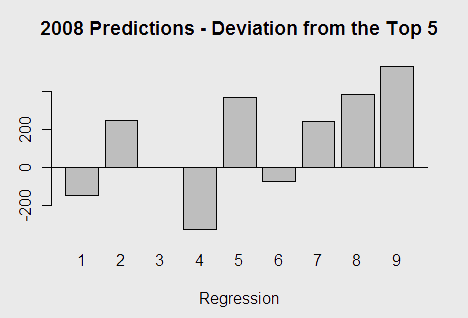
After completing the R2 comparative analysis, I decided to test the efficacy of each model for actually predicting the scores of the final top 5 teams (due to missing regionals scores, such a direct comparison for the final top 10 would be impossible for all the models) by withholding the data from 2008, re-running all of the models, automatically making predictions, and measuring the mean deviation from the actual scores in the predictions. This created the following bar chart:

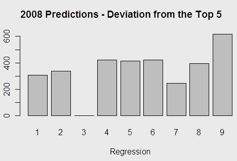
To ensure that the performance wasn’t just a factor of particularly grievous errors canceling each other out, I ran the program that performed the previous calculations with the mean of the absolute value of prediction deviation.

Where I was previously rather confident about fit 9 as the best model, this gave me significant pause. Model nine had, by almost 200 points, the worst performance by this metric. Model 7 – one with regionals scores included – had a surprisingly good performance. The big takeaway, however, was that adding incremental things didn’t change the model all that much. While one could maximize the R2 value into the .90 range, in 2008, the best model for predicting scores was to use the historically linear relationship between State scores and Nationals scores. Maximizing R2 led to significant overfitting, and made the model I thought to be most intuitive work poorly for predicting 2008.
Coefficient Analysis – Fit 1 & Fit 9
Here, I will analyze the coefficients in two of the nine regressions, and put forth their significance. First, here are the coefficients for fit 9, with related data.
| Estimate | Std. Error | t value | Pr(>|t|) | |
|---|---|---|---|---|
| (Intercept) | 1.772e+04 | 4.911e+03 | 3.609 | 0.000636 *** |
| STA | 6.016e-01 | 1.117e-01 | 5.384 | 1.32e-06 *** |
| TIER | -1.014e+04 | 3.035e+03 | -3.343 | 0.001446 ** |
| WIS | 6.451e+02 | 3.980e+02 | 1.621 | 0.110406 |
| ILL | 6.803e+02 | 4.835e+02 | 1.407 | 0.164622 |
| STA:TIER | 2.306e-01 | 6.719e-02 | 3.432 | 0.001102 ** |
These coefficients indicate that, to create an estimate (with 95% confidence) of a school’s nationals score, one would need to take roughly 40-80% of their state score, subtract 7140-13140 multiplied by the tier, add in 17-29% of the quantity state score multiplied by the tier, add an intercept value of roughly 17000, and (if the school is from Wisconsin or Illinois) add in 645 or 680 points, respectively. The confidence interval for the intercept is less useful than those for the rest; the amount of variance for the intercept is enormous. A small shift in slope at the x = [40000, 52000] range would cause the intercept at x=0 (that is, the one given) to shift enormously. As thus, it is not necessary to interpret the intercept in quite the huge interval given; as we are interested in calculating teams in a narrow range of scores from 40000 to 52000, we aren’t altogether concerned with how the intercept changes to account for scores below that range.
Now, here are the coefficients and related data for fit 1.
| Estimate | Std. Error | t value | Pr(>|t|) | |
|---|---|---|---|---|
| (Intercept) | 7.975e+02 | 2.059e+03 | 0.387 | 0.7 |
| STA | 9.931e-01 | 4.462e-02 | 22.255 | <2e-16 *** |
This is far more straightforward. Though the intercept is, again, difficult to interpret (the confidence interval indicates it has scarcely a 60% chance of having a positive sign in the first place), it indicates that a team (at the very least) tends to retain virtually all points earned in its state score at nationals, the confidence interval indicating a school’s nationals score is 95-103% of its state score, plus an arbitrary intercept constant with a bit of a higher chance of being positive than negative. This indicates a relationship that anyone who has scanned the data would note – nationals scores are virtually always higher than state scores, and when they’re lower, they aren’t lower by much.

